To kill a mock-up, first

I ran my first design sprint last week. According to the creators:
The sprint is a five-day process for answering critical business questions through design, prototyping, and testing ideas with customers.
The starting point of a sprint could be a problem like “website visitors don’t understand our product.” Monday is spent mapping out the problem, Tuesday and Wednesday on coming up with solutions and choosing one. On Thursday, you build a prototype, and Friday, interview users and have them test the prototype. While usually done in a team of up to seven people, I went through it alone. This was awkward at times, but I would still recommend it for solo founders.
Over time, I’ve brainstormed ideas of where AI-supported visual curation — the core technology behind my previous product — might help. I decided to use the sprint to test one of those ideas. My hunch was that for online stores with hundreds or thousands of items, managing tags and categories is tedious manual work — yet necessary for a shopper to find products by look and feel, not just flat product categories.
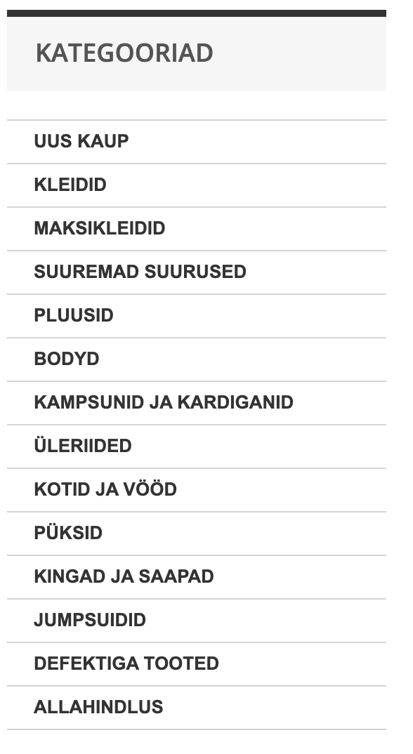
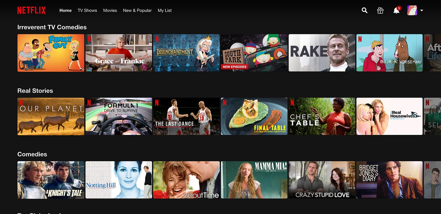
More visually, I imagined it would be valuable to turn online shopping from this…
…to this.
I’ve never operated an online store and don’t have friends that run one. So I knew almost nothing about the problem or customer. To an extent, I started the sprint from the wrong place, wanting to build an AI-based solution, not solve a problem. Regardless, I would mock up the AI part like any other, so I would still avoid the trap of building things that are fun to build instead of solving real problems.
After mapping out the problem and sketching several potential solutions, I ended up with a prototype of a simple tool that gives online store owners recommendations on how they might group products into collections. That’s what I took into the user interviews on Friday.
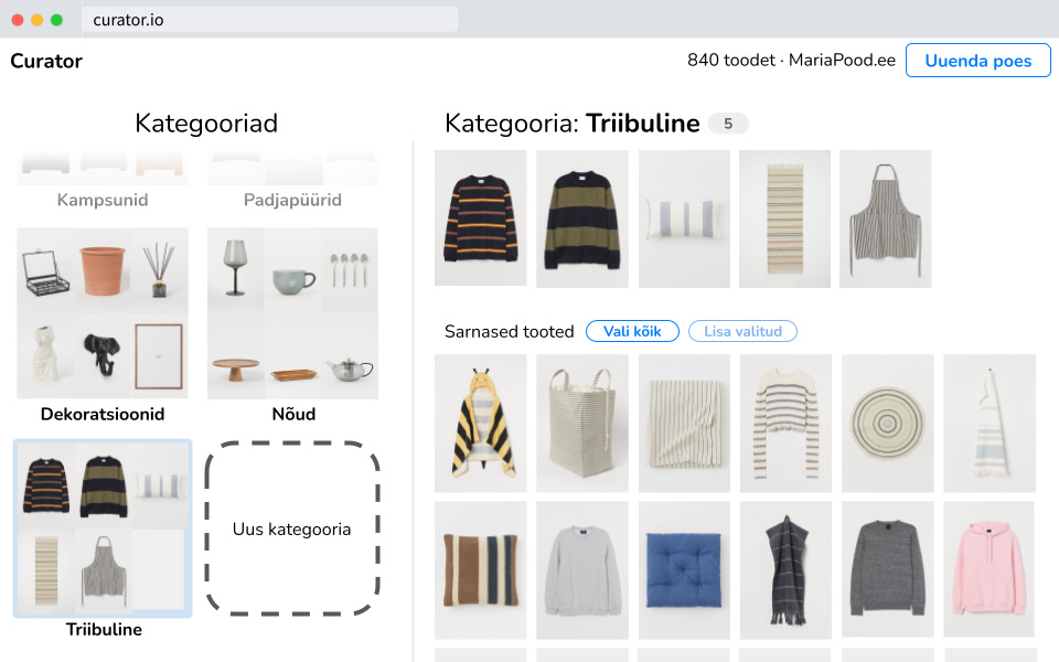
I’ve done user interviews before, so asking open-ended questions wasn’t difficult for me. In contrast, showing users the prototype was nerve-racking! Seeing people struggle with basic tasks, the urge to guide them through is strong — yet that would defeat the reason I set up the interview in the first place.
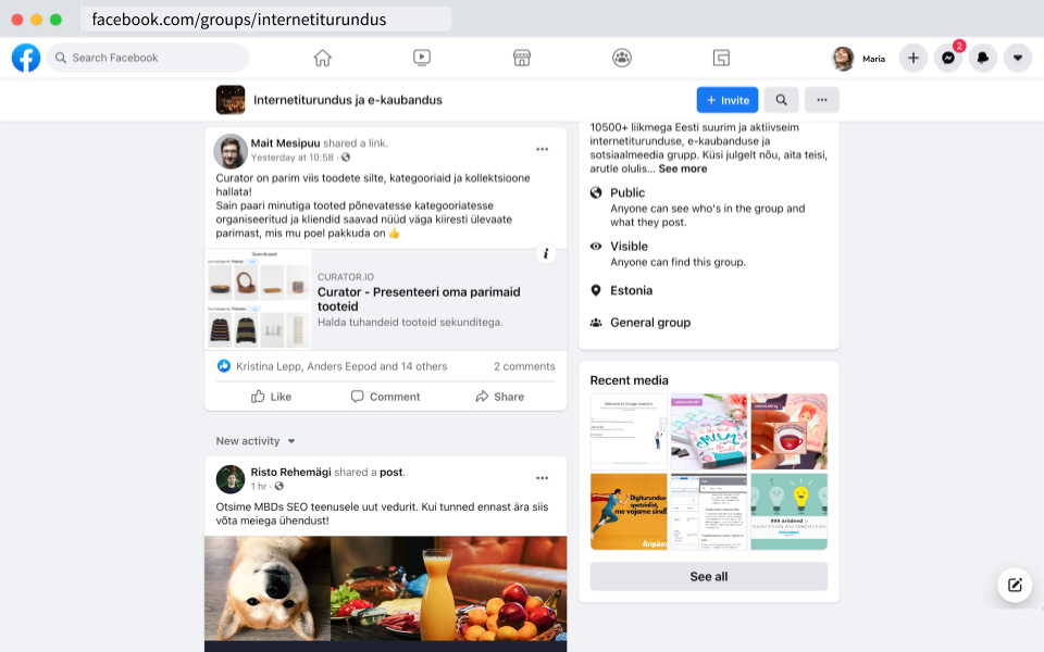
Here’s how the user-testing part of the interview went. The first screen was a doctored screenshot: a post about the product I was prototyping in the same Estonian e-commerce Facebook group I had recruited users from. The prompt for the users to start the test was, “you see this Facebook post and want to decide whether you’d like to try this product in your store.”
In the hardest moment of all the interviews, my internal screaming peaked when one user refused to use the prototype at all. She bluntly said she didn’t need the product and decided not to click on the link. Even after a soft nudge, they refused to try it. You don’t have to imagine my attempt to hide the painful surprise because it’s on camera.

Of course, this refusal was valuable. I first thought the pitch in the fake Facebook post wasn’t compelling. But then I learned this user couldn’t have the problem I imagined. Her online store ran franchises of large European brands, and every decision about product presentation was handed down from the headquarters. All they had to do was dutifully implement it, so no need for curation.
From the interviews, I learned that curation wasn’t really a problem for the store managers. I did find some related problems: localizing product information, running frequent campaigns, and others, which I decided not to pursue.
The idea wasn’t a success, but I learned several important things about my process.
Before the sprint, I’d thought of design as mostly about presenting information visually in a way that makes for a good experience. My designer-friends tell me that was kind of true twenty years ago, so maybe I’d been stuck in the twentieth century. Now, though, I think of design as a set of mental models and practices for finding and solving problems.
The double diamond is one of those mental models. The most important concept there is a contrast between two types of thinking: divergent and convergent. For example, if you and three friends are planning a trip abroad (remember those?), you’ll probably start with pitching a bunch of potential destinations, activities, and schedules. That’s divergent. At some point, though, you have to narrow it down and buy the flights to your destination. That is, you need to converge to a single decision.
So, divergent thinking is about coming up with lots of data, impressions, and other pieces of information. Convergent thinking is compression: distilling all of those pieces into something smaller, simpler, and easier to work with. You might have multiple consecutive diverging-converging steps. Having bought the flights, you could do one to figure out the day-by-day itinerary, converging on a plan about which city to stay at each night. Perhaps another to diverge and converge on selecting a specific AirBnB in each city.
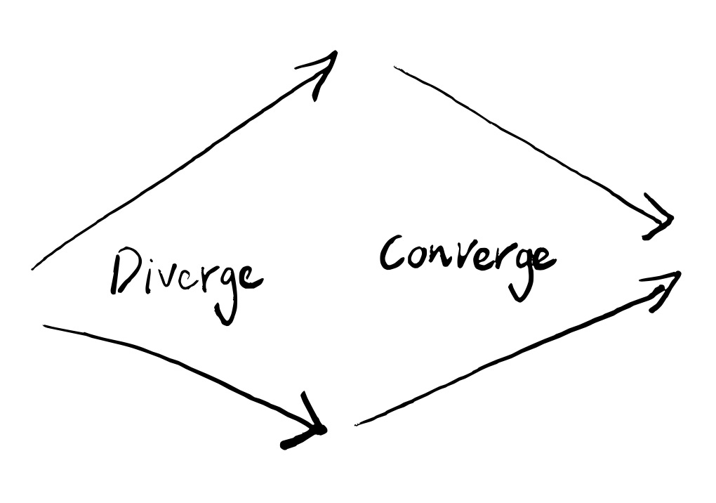

In hindsight, it turns out I’ve spent most of my product-market-fit efforts in the convergent mode. You might have predicted that from my engineering background: all of my professional life, I’ve gotten paid for finding solutions, not problems. But as an entrepreneur, it’s started to obstruct me. Jumping into a solution the second I think about a problem is very unlikely to give me a good solution. Diagnosis: premature convergence.
Even more important than any framework of thinking was a lesson about the value of ideas. Of course, I had heard that startup ideas themselves are worth nothing. However, there’s a difference between that and seeing your favorite idea relentlessly destroyed by just a day’s worth of user interviews. I now get the frailty of an idea before the world hardens it.
I’m definitely still taking my ideas too seriously. Two data points — my original idea of a fast classification tool and the design sprint idea of an online store product curation tool — are not much. But I now have the lust for idea-blood. I’m looking forward to mercilessly throwing ideas into the arena and seeing if they survive.
